Same Booking, Before and After: One Form Becomes Three Screens
Article by PixelA
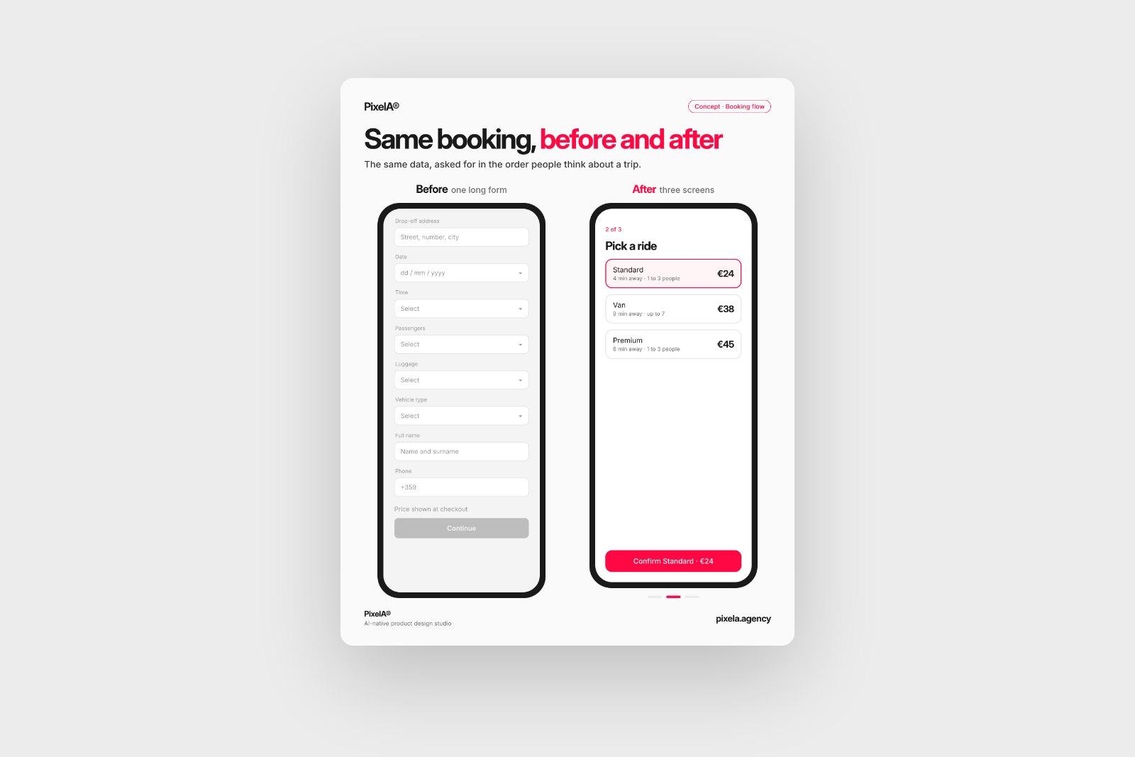
A transfer booking form with nine fields and the price hidden until checkout, redesigned as three screens. Same data, asked for in the order people think about a trip. A concept, shown in motion.
This is a concept we sketched to test an idea: what happens to a typical transfer booking form if you keep every piece of data it asks for, but change the order and the number of screens?
Before: one long form
Nine fields, five dropdowns, and a "Continue" button at the bottom. The price only appears at checkout, after people have typed their name and phone number. It works, but it asks for everything up front and gives nothing back until the end.
After: three screens
- Where to. Two places and a time, with the price visible from the start. Most people decide whether to book based on price, so it comes first.
- Pick a ride. Every option shows how far away it is and what it costs. One tap selects it.
- You're booked. The driver on the map, and nothing left to fill in.
What actually changed
Nothing under the hood. It's the same data, asked for in the order people think about a trip: where, when, how much, which car. Contact details can come from the account or a quick sign-in at the end, instead of blocking the first screen.
We showed it in motion because a static screen can't show how the steps connect. The transitions are where you notice if a flow feels light or heavy.
What's the longest form your product still asks people to fill in? That's usually the best place to start.
We share one of these breakdowns every week on LinkedIn. Want them in your inbox instead? Subscribe at the bottom of the page.