Motion That Earns Its Place: 6 Moments in a Product
Article by PixelA
Motion is the cheapest way to make a product feel expensive, if it shows up in the right places. Here are the six moments where it helps people, and the one place it never should.
Motion is the cheapest way to make a product feel expensive. Most apps either have none, or have it everywhere. The good ones use it in a handful of moments where it actually helps people understand what just happened.
1. Loading
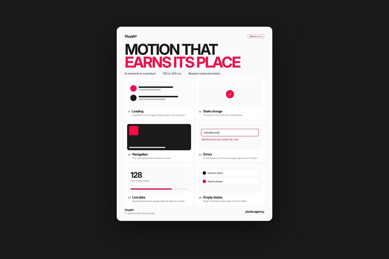
Show a skeleton in the shape of the real content, not a spinner. People read the layout before the data arrives, so the screen feels ready sooner and nothing jumps when it loads.
2. State change
Let the button turn into the confirmation. When a payment goes through, one morph from "Pay" to a tick says "done" faster than a toast in the corner, and it happens exactly where the person was looking.
3. Navigation
The card grows into the detail screen. A shared element that travels from the list to the page keeps people oriented: they never lose track of where they came from, or how to get back.
4. Errors
A small shake, and the message right under the field. The problem shows up where the eyes already are, instead of in a banner at the top of a long form.
5. Live data
Numbers that count up and progress bars that fill get noticed without another alert. Change is easier to see than a new value sitting still.
6. Empty states
Show what the screen will do once it's filled. A short loop of the first item sliding in turns an empty screen into the first step, not a dead end.
Where motion doesn't belong
Anything that makes people wait. Keep interface motion around 150 to 300 milliseconds, let it start from the thing the person touched, and respect the reduced motion setting on their device, so the product still works perfectly with motion turned off.
How we use this
We prototype these moments before anything gets built, on a real phone, so clients feel the product instead of imagining it. It's also the fastest way to find the screens where a flow is confusing: if a transition is hard to design, the step behind it usually needs rethinking.
We share one of these breakdowns every week on LinkedIn. Want them in your inbox instead? Subscribe at the bottom of the page.