eBag
Delivery App · E-Commerce Platform · Brand & Marketing
Client: eBag
Duration: Ongoing engagement
Year: Since 2024
Categories:
- Design System
- E-Commerce
- Mobile App
- Product Design
- UX/UI Design
- Brand Identity
- Strategy & Positioning
Tools Used:
- Figma
- Claude
- Figma Make
- Monday
- Jira
- Chat GPT
- Gemini
Our team mates who took part in this project

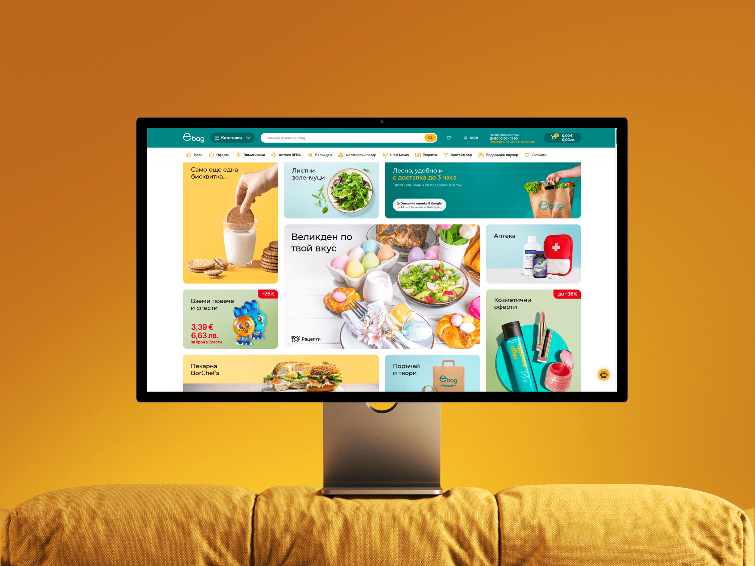
eBag runs across three surfaces: a customer website, a mobile ordering app, and a delivery driver application. Each had its own design debt, inconsistencies, and friction. Our role was to lead design across all three, and build the driver app from scratch.
Approach
We mapped the full product before touching a single screen. Three surfaces. Three user types. Three completely different contexts of use. The audit surfaced two priorities immediately: the checkout flow was losing customers, and the driver app didn't exist yet. We addressed both in parallel while building a shared component library to unify all three surfaces for the first time.
Vision and Innovation
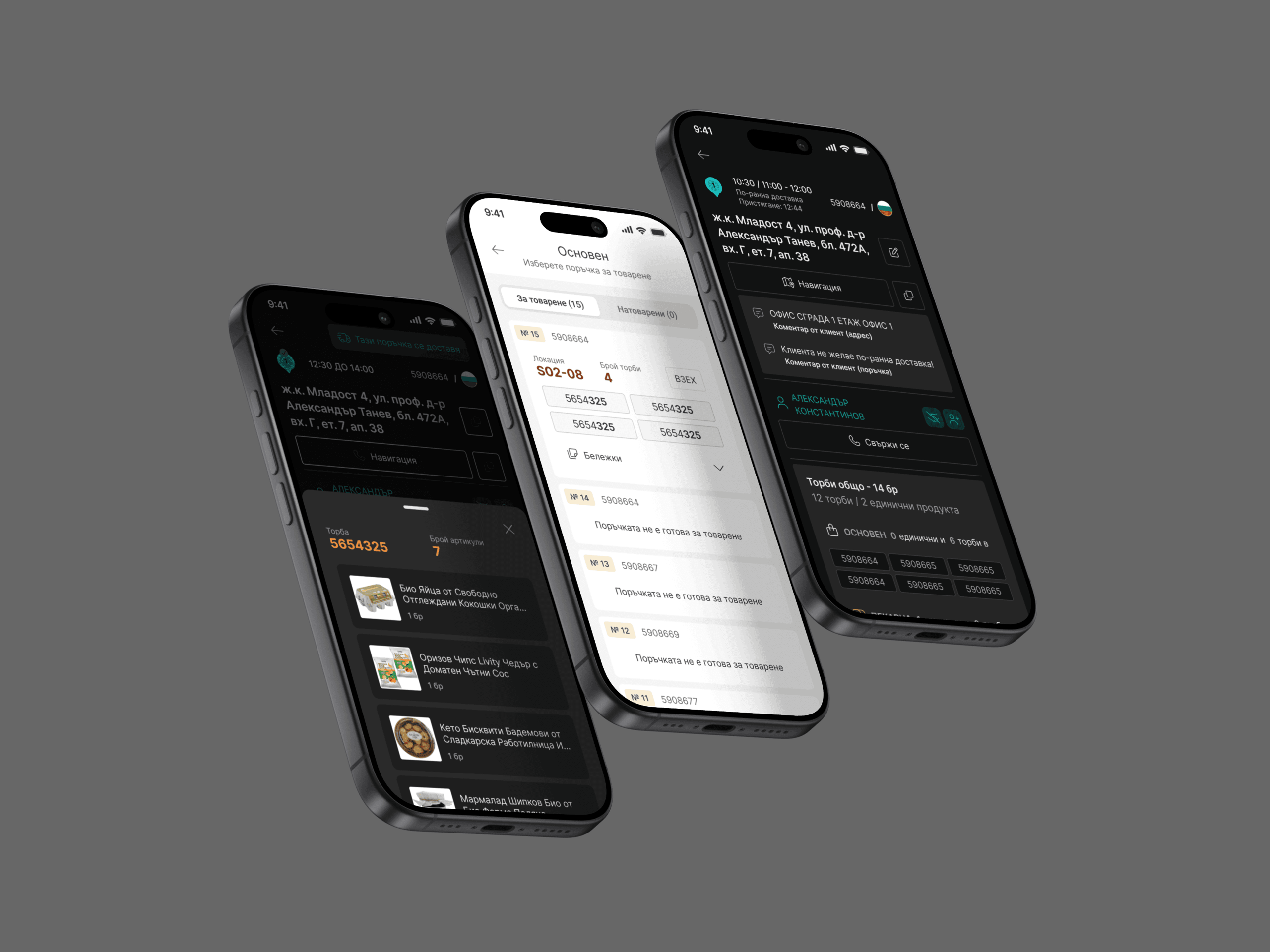
The driver app was built from zero, designed for one-handed, in-cab use under time pressure. Large targets, minimal reading, zero ambiguity at every step.
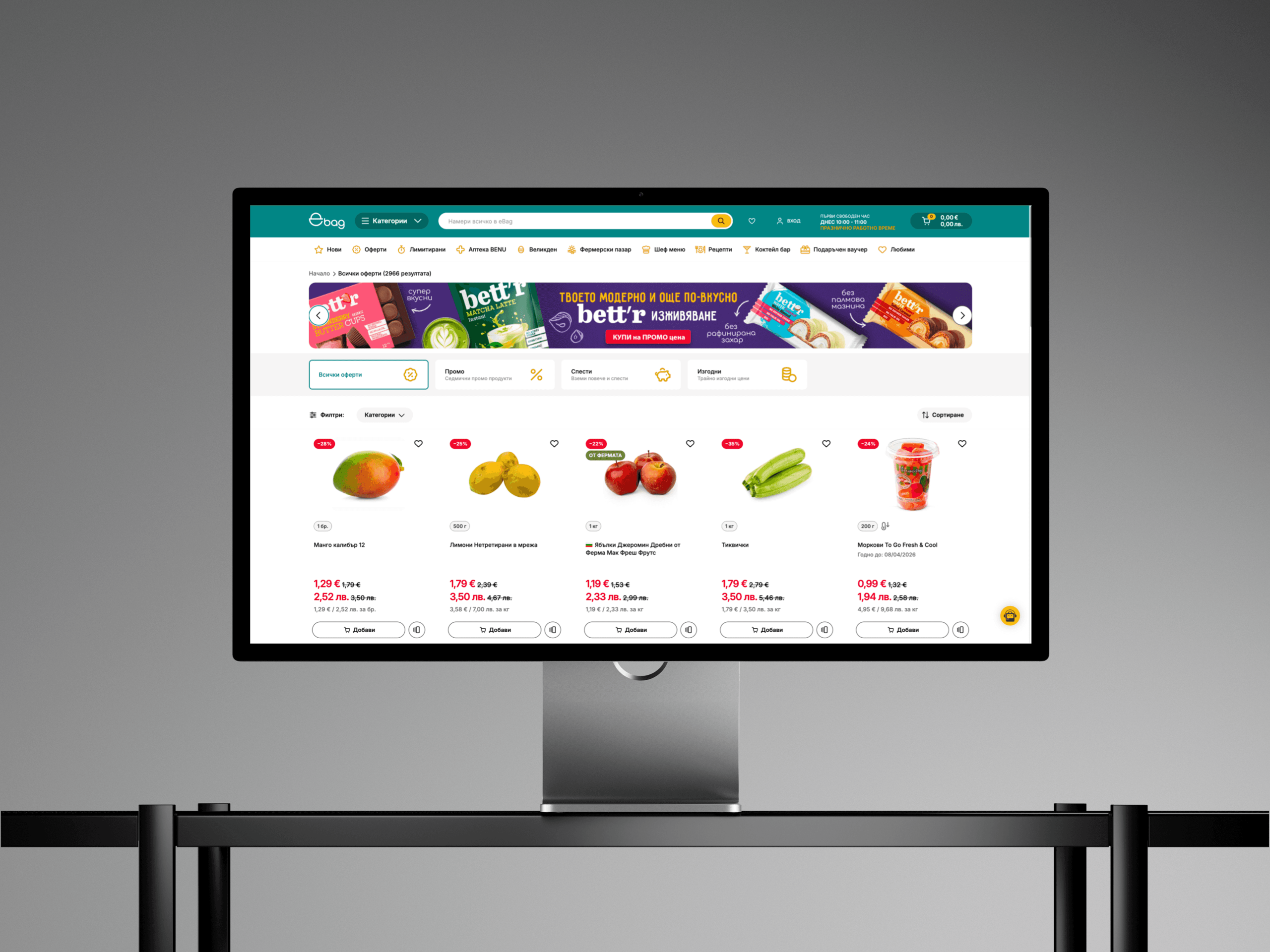
For customers, the checkout went from seven steps to three for returning users. Real-time delivery slot availability was added directly into the flow. The result was a checkout people trusted, not just one that looked cleaner.
Identifying Unique Challenges
Three user types with radically different needs, sharing one product ecosystem. A design system with no single source of truth. And a driver app that had to work reliably in conditions actively hostile to careful reading.
Resolving Complex Problems
A shared Figma component library came first, before any new screen was designed. The checkout was reduced from seven steps to three for returning users. The driver app was tested against real field scenarios: one hand, moving vehicle, variable light. Offline handling was built as a feature, not a fallback.
User-Centric Design
Every decision came back to one question: does this make the person's job easier? For customers: fewer decisions, clearer feedback, a checkout that felt trustworthy. For drivers: fast load, only what's relevant, never a paragraph where a button would do.
Meeting User Needs
The checkout redesign removed the friction that was costing conversions. The driver app replaced phone calls, text messages, and manual logging with a structured, timestamped workflow that works for everyone: drivers, dispatchers, and the business.
Conclusion
NPS reaching 98% after the checkout redesign is a number worth standing behind. The driver app shipping to iOS and Android is another. The engagement continues, which is exactly how a real design partnership should work.
Check also other projects of ours

Newsletter
Stay ahead
with PixelA®
Join our newsletter for fresh insights, trends, and stories that fuel creativity and innovation.