DEV.BG
Job Board · B2B Landing Page · Client Portal · AI Workshops
Client: DEV.BG
Year: 2026
Categories:
- Web Design
- UX/UI Design
- Product Design
- Design System
Tools Used:
- Claude
- Figma
Our team mates who took part in this project

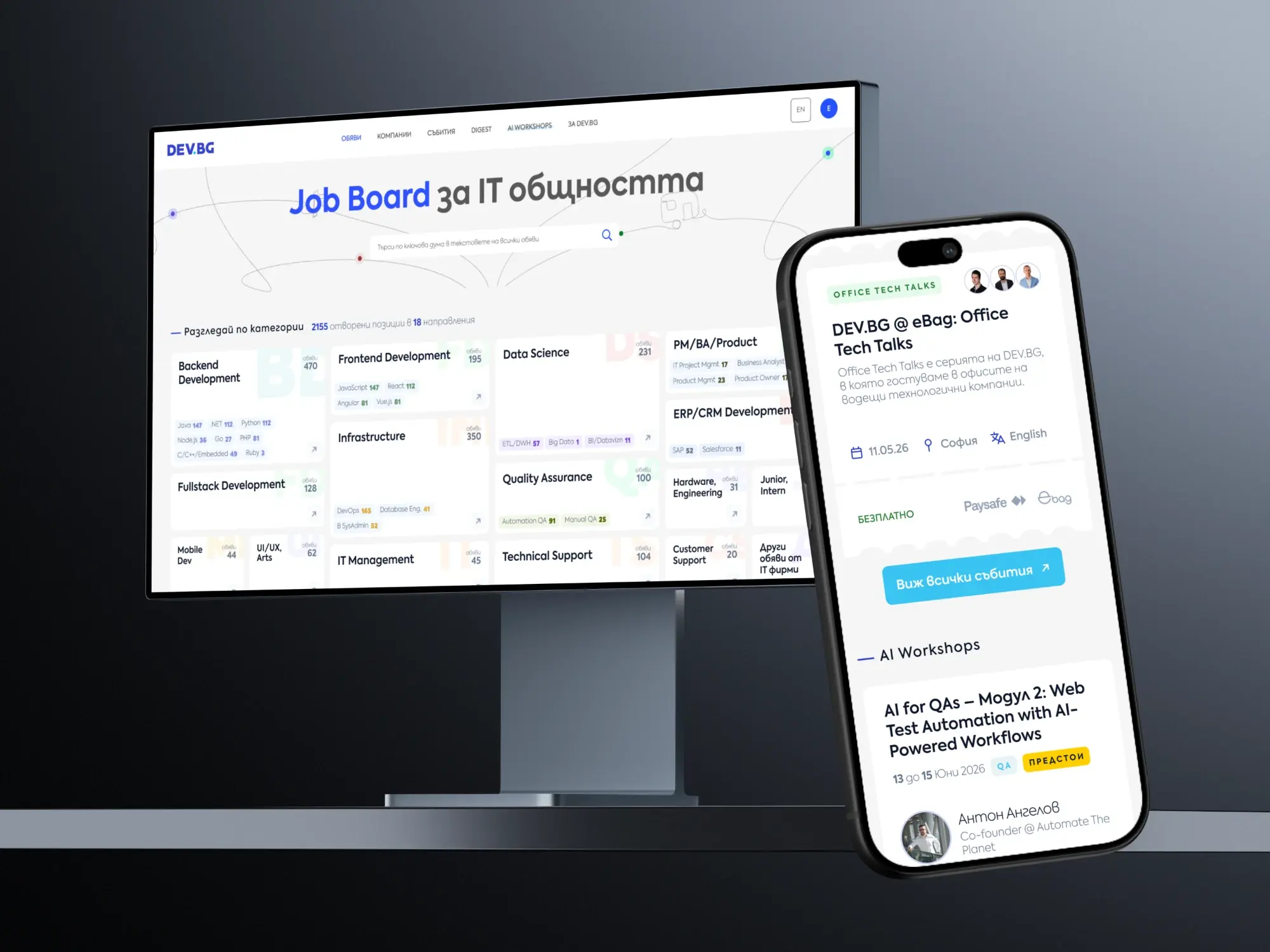
DEV.BG is the job board and community where Bulgaria's IT people look for their next role. We redesigned the parts of the product that earn its money and its audience: the page that sells listings to employers, the portal where companies run them, AI Workshops with a checkout of their own, the Digest and the job board home. All of it on desktop and mobile, with typography rules the rest of the site can follow.
Interactive preview
Scroll and click inside the frame.
Selling to employers
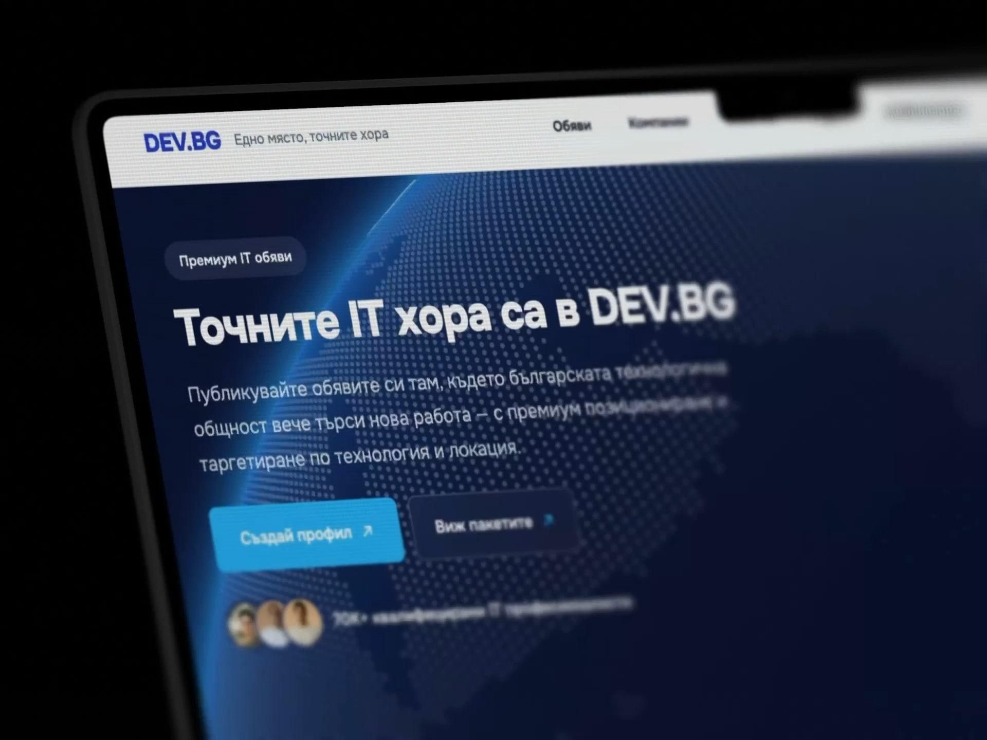
The header and footer come from the live site and stay as they are, so everything had to work inside the page itself. The main call to action moved into the hero, and a slim bar keeps the lowest listing price in view while people scroll. On mobile the same job falls to a bar at the bottom with the price and one button.
Pricing people can read
Listings are sold as prepaid credits. We laid the packages out side by side, with the price per listing, the total and the saving next to each other, so the deal is clear before anyone has to ask. No subscription and no start date are stated once, under the packages, instead of in the small print.
Typography rules
Bulgarian set in capitals with wide tracking is hard to read and makes a page feel templated. We wrote rules for the whole site: caps only on small tags and one eyebrow per section, sentence case for job details and captions, and three to four text levels built from size, weight and colour.
AI Workshops
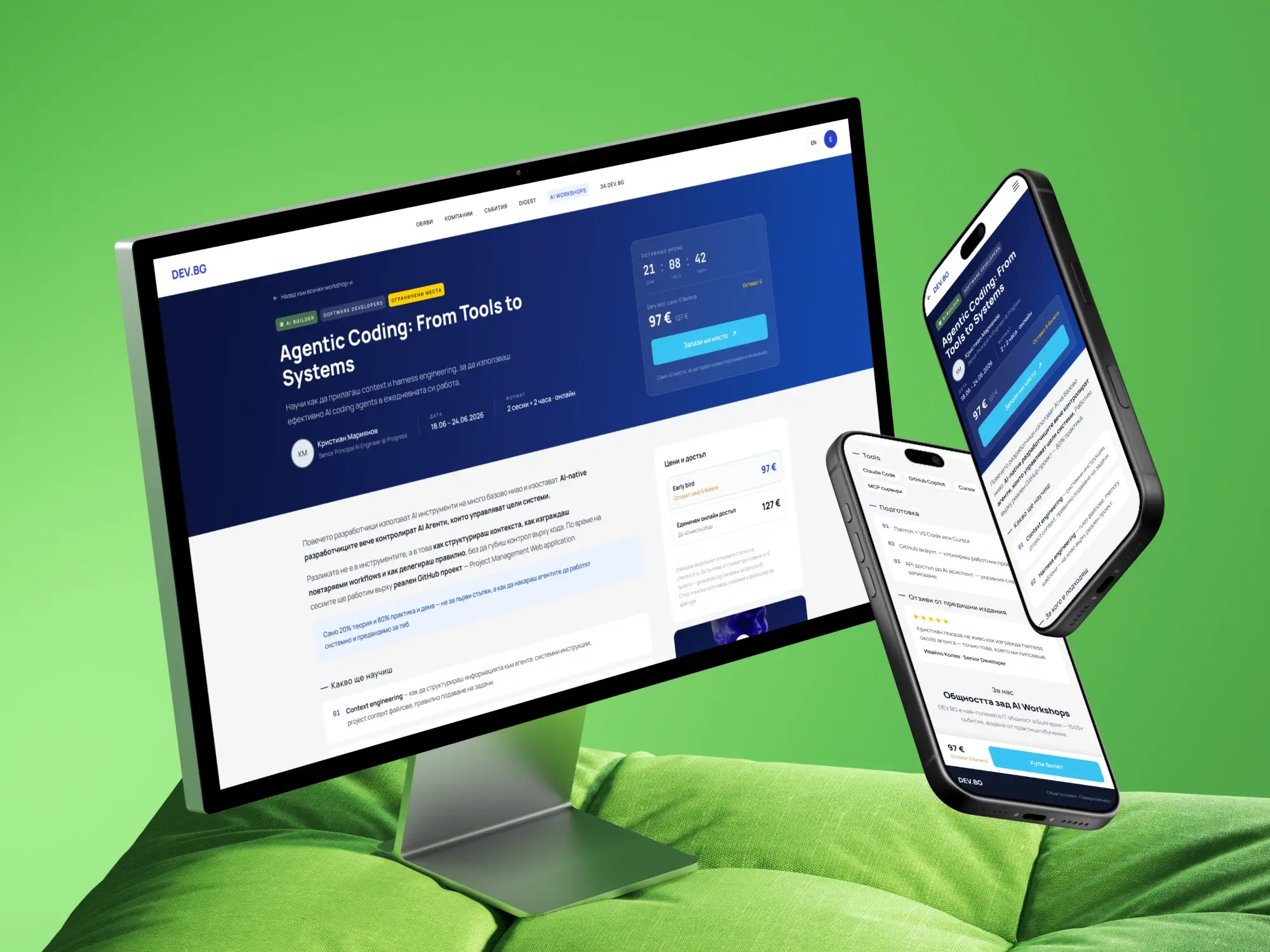
Each workshop page answers the buying questions first: who it is for, when it runs, how many seats are left and what it costs. A countdown and the early bird price sit next to the title, and the ticket choice follows you down the page, so the decision is always one tap away.
Finding the right one
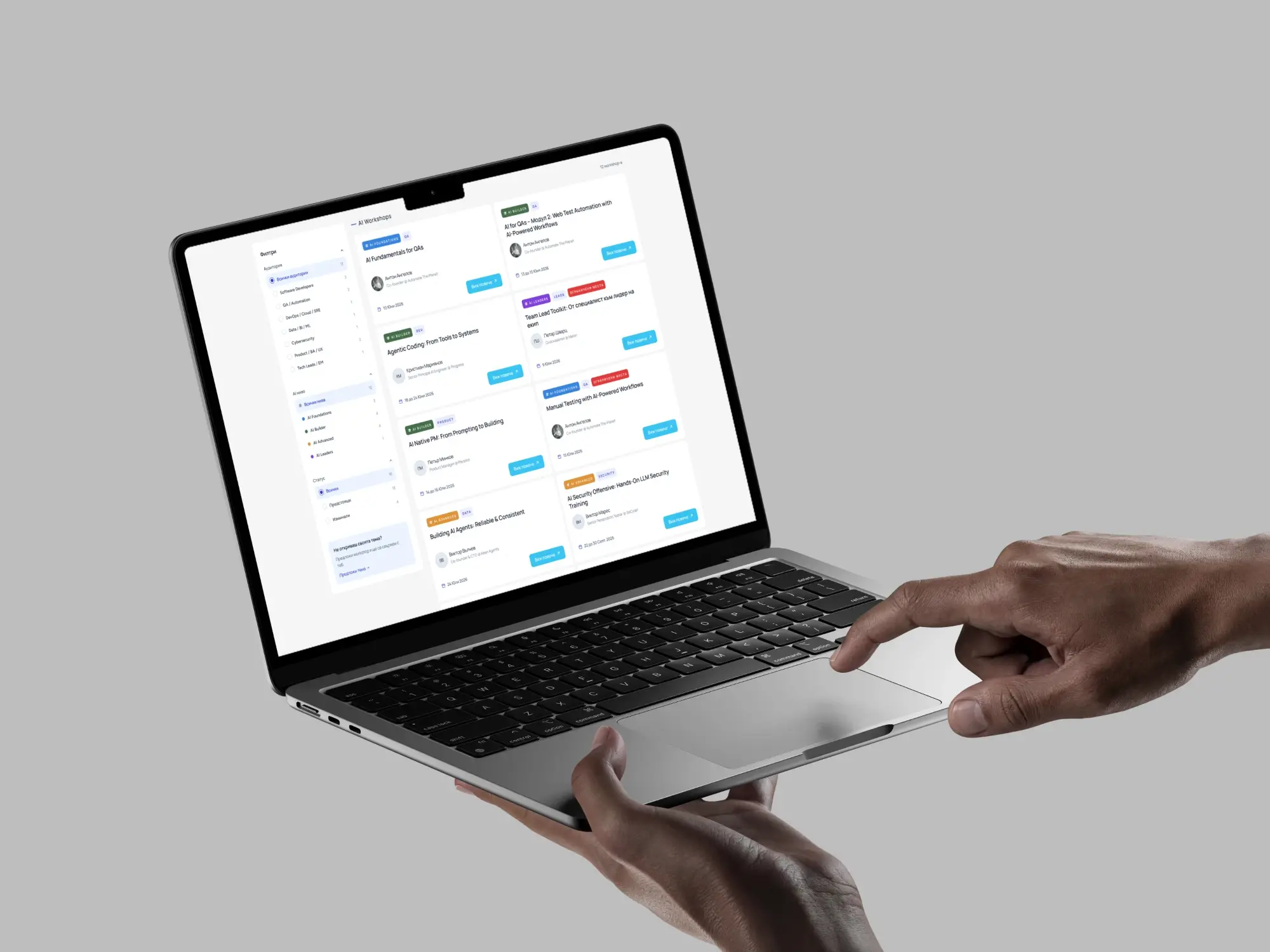
The catalogue filters by audience, AI level and status, with live counts on every option. Level tags use one colour each, from foundations to leaders, so people can scan a full grid of workshops and spot their level without reading every card.
A checkout in three steps
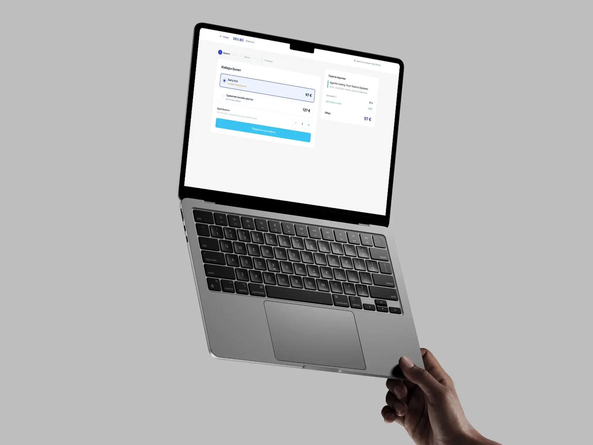
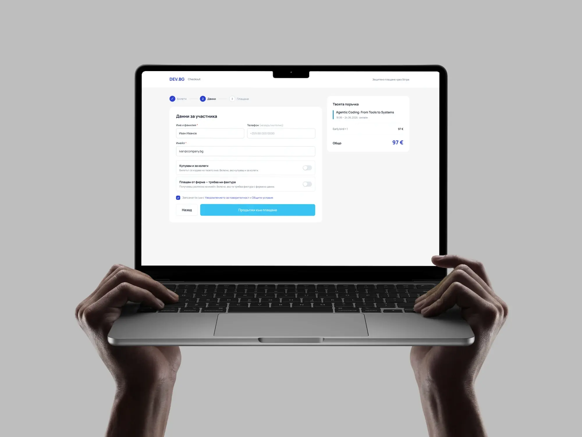
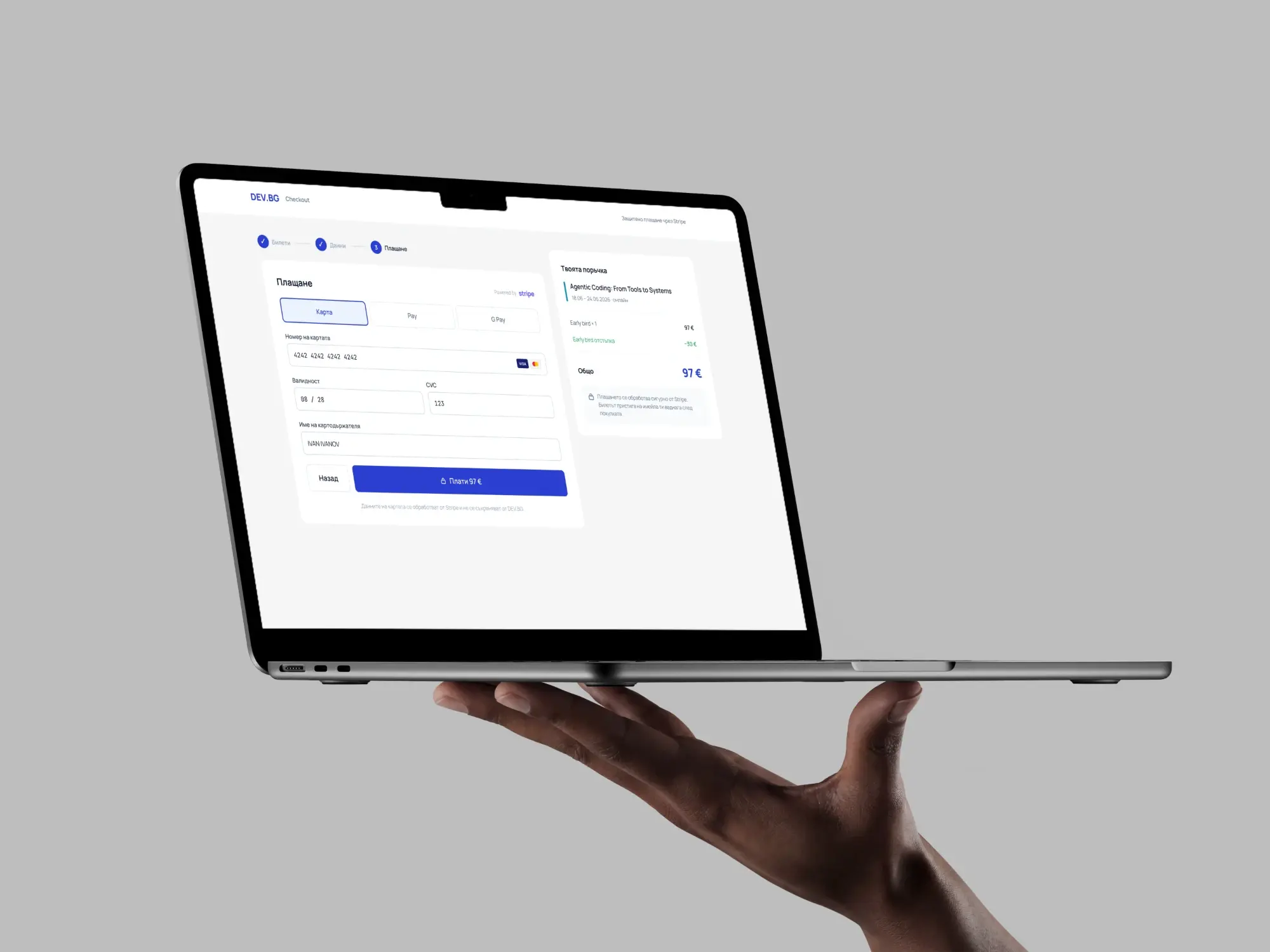
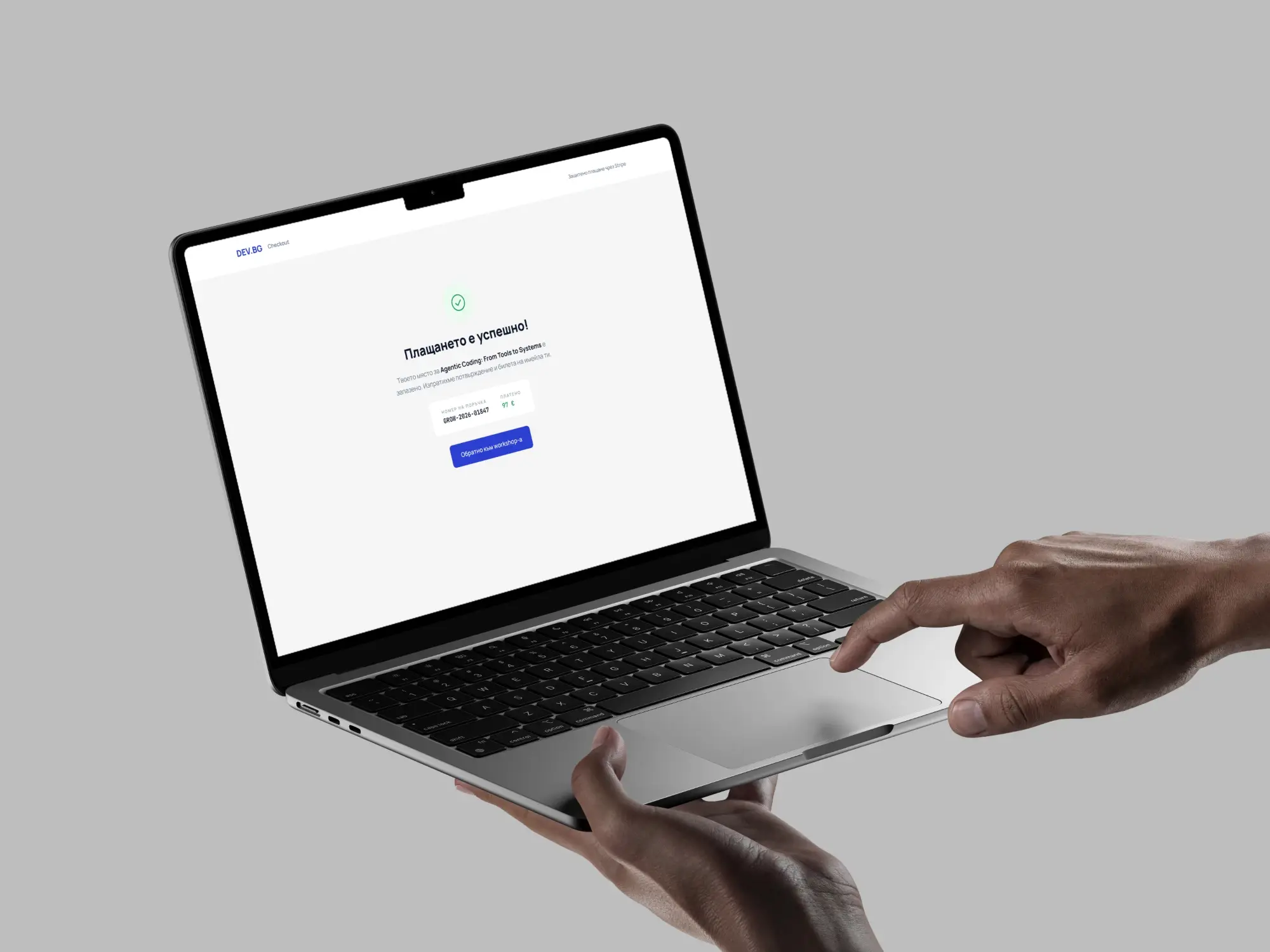
Tickets, details, payment. The order summary stays on the right the whole way, so the price never changes behind anyone's back. Buying for colleagues and asking for a company invoice are switches, not extra pages, and card, Apple Pay and Google Pay are handled by Stripe.
Client portal
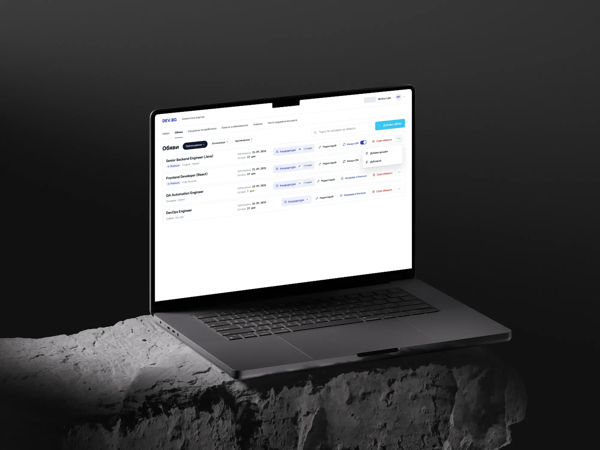
Companies run their listings from one table: published, pending and archived, with the number of candidates and how many are new. Editing, keeping a listing always on, upgrading it to premium and stopping it are all on the row, so no one has to open a listing just to act on it.
On the phone too
Recruiters often check candidates away from their desk, so the portal works just as well on a phone. Credits stay at the top, and the same actions fold into a menu on each listing.
Digest
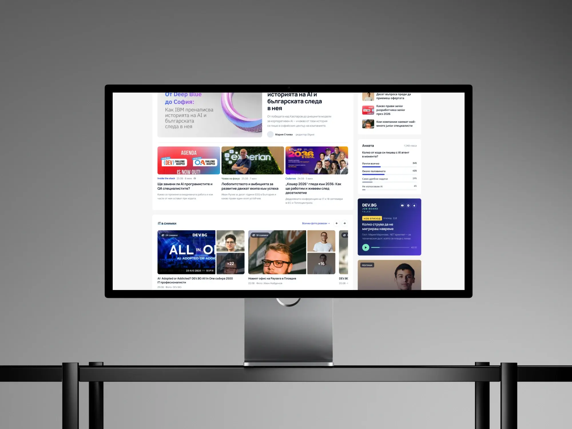
The Digest brings DEV.BG's editorial side into one place: stories from the IT community, photo reports from events, a poll and the podcast. Clear categories and reading times help people pick what to read next.
Check also other projects of ours


Newsletter
Stay ahead
with PixelA®
Join our newsletter for fresh insights, trends, and stories that fuel creativity and innovation.