Type That Feels Designed: 6 Typography Rules
Article by PixelA
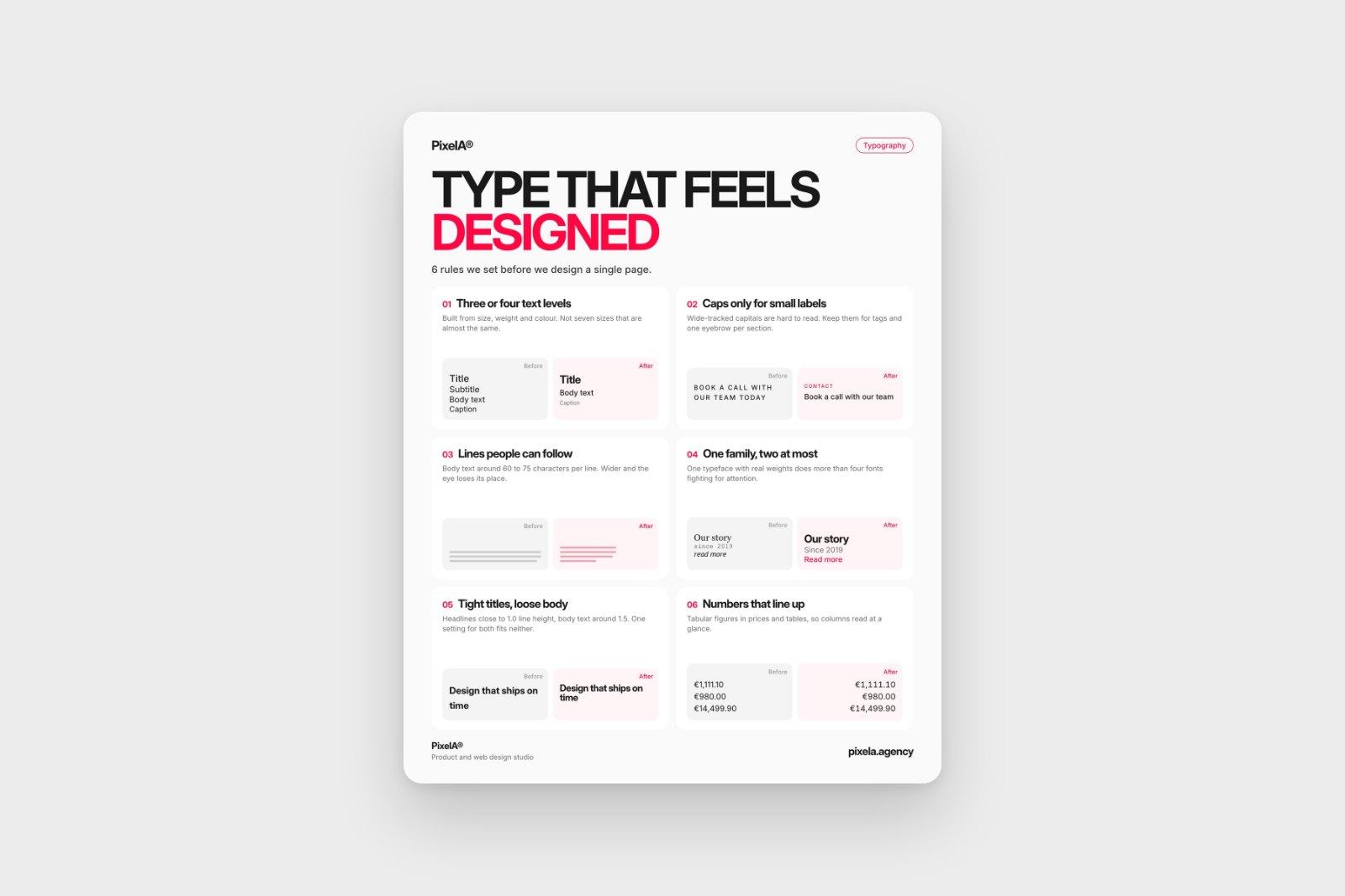
Most websites that feel cheap don't have a colour problem. They have a type problem. These are the six typography rules we set before we design a single page.
Most websites that feel "cheap" don't have a colour problem. They have a type problem. These are the six typography rules we set before we design a single page.
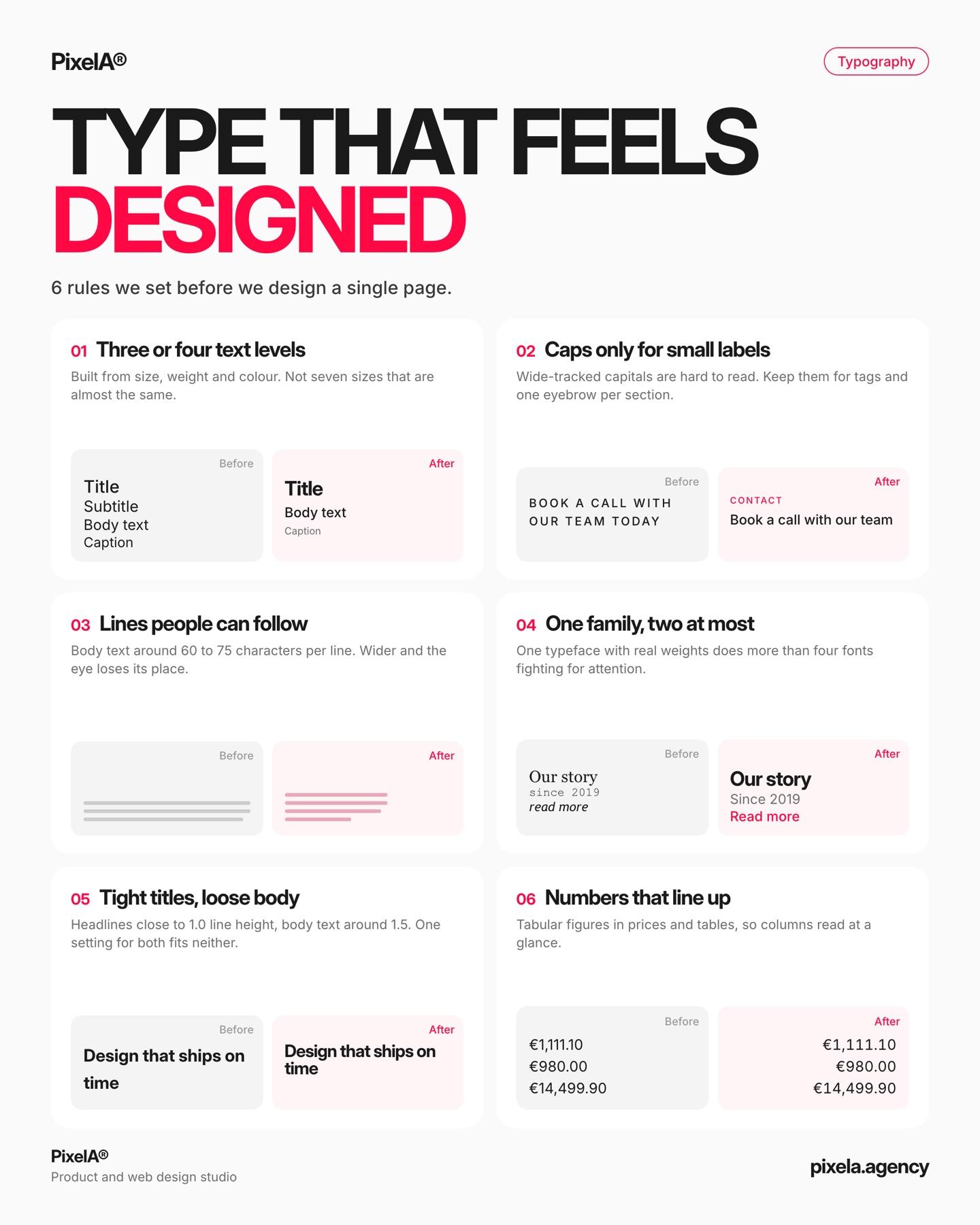
1. Three or four text levels
Built from size, weight and colour. Not seven sizes that are almost the same.
2. Caps only for small labels
Wide-tracked capitals are hard to read. Keep them for tags and one eyebrow per section.
3. Lines people can follow
Body text around 60 to 75 characters per line. Any wider and the eye loses its place.
4. One family, two at most
One typeface with real weights does more than four fonts fighting for attention.
5. Tight titles, loose body
Headlines close to 1.0 line height, body text around 1.5. One setting for both fits neither.
6. Numbers that line up
Tabular figures in prices and tables, so columns read at a glance.
Save this for your next redesign. Rules 1 and 2 came straight out of our DEV.BG work, where Bulgarian set in wide capitals was the first thing to go.
We share one of these breakdowns every week on LinkedIn. Want them in your inbox instead? Subscribe at the bottom of the page.