Pricing Pages People Can Actually Read
Article by PixelA
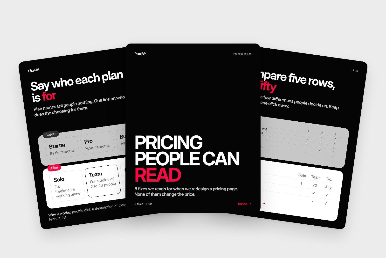
Most pricing pages don't have a price problem. They have a reading problem. Six fixes we reach for when we redesign one, and none of them change the price.
Most pricing pages don't have a price problem. They have a reading problem. These are the six fixes we reach for when we redesign one.
01 / 08
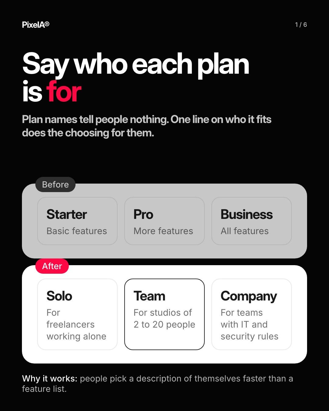
1. Say who each plan is for
"For studios of 2 to 20 people" beats "Pro". People pick a description of themselves, not a feature list.
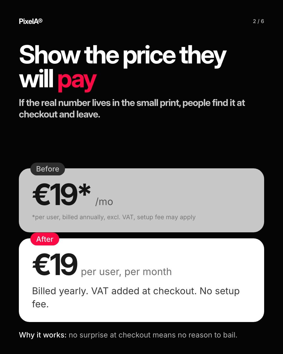
2. Show the price people will pay
No asterisks. VAT and billing in plain words.
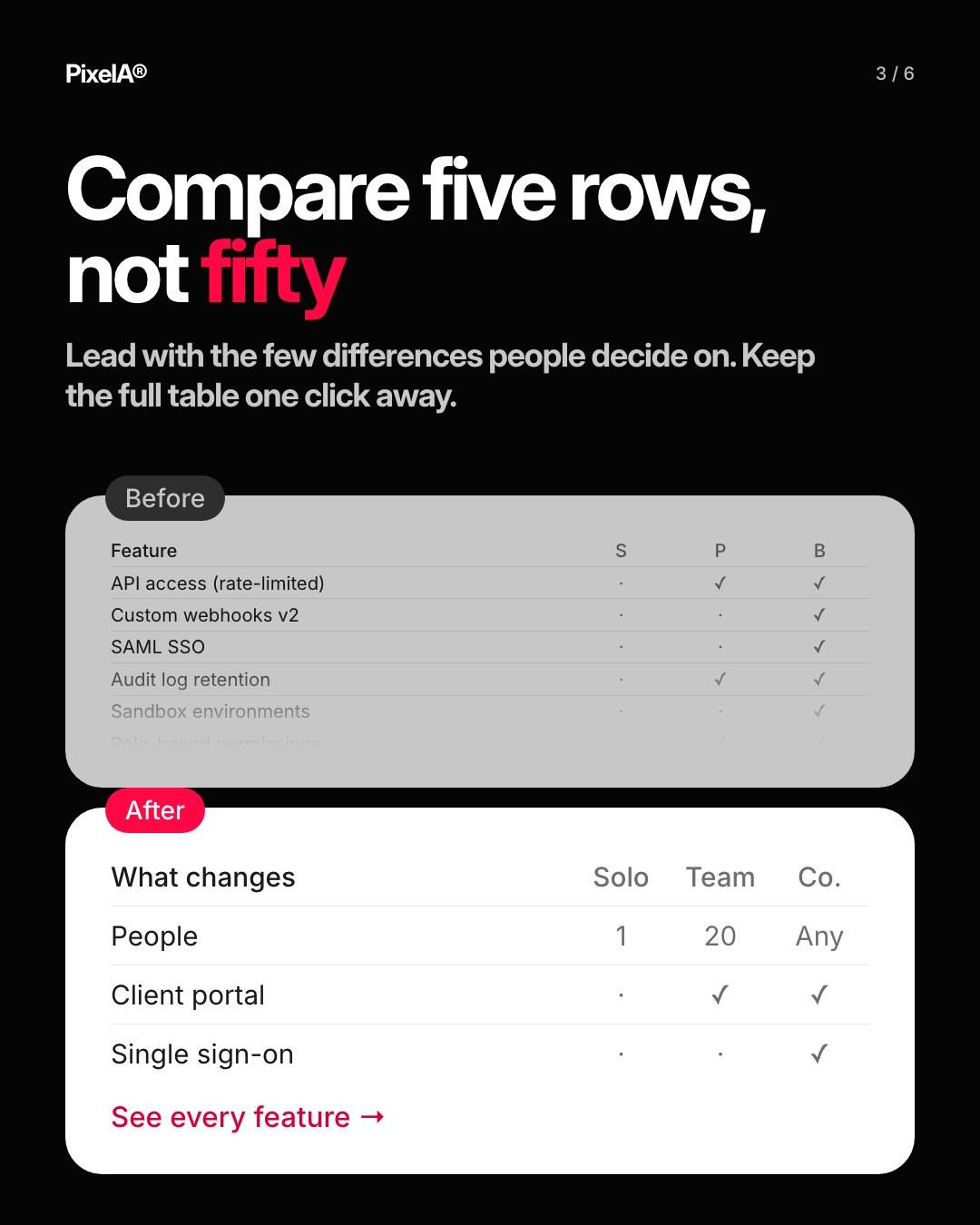
3. Compare five rows, not fifty
Lead with what changes between plans. The full table is one click away.
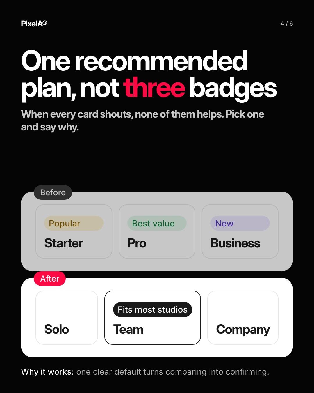
4. One recommended plan
Three badges cancel each other out.
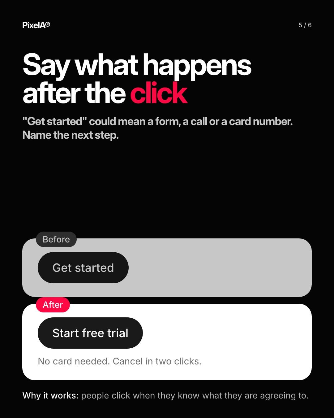
5. Say what happens after the click
"Start free trial, no card needed" beats "Get started".
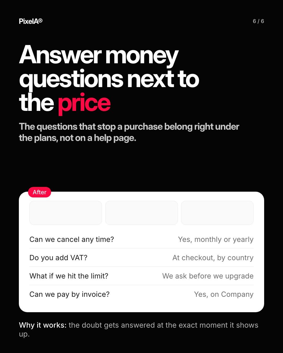
6. Answer money questions next to the price
Cancel, VAT, limits, invoices. Right under the plans, not in an FAQ at the bottom.
None of these change the price. They make the decision easier.
We share one of these breakdowns every week on LinkedIn. Want them in your inbox instead? Subscribe at the bottom of the page.