DEV.BG: Redesigning the Page That Sells Job Listings
Article by PixelA
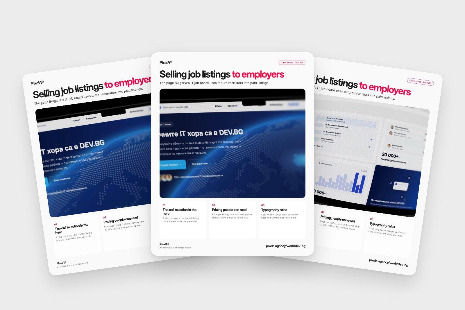
DEV.BG is where Bulgaria's IT people look for their next role. We redesigned the page that turns a visiting recruiter into a paid listing: the call to action, the pricing and the type rules behind it.
DEV.BG is where Bulgaria's IT people look for their next role. The page for companies has one job: turn a visiting recruiter into a paid listing.
1. The call to action moved into the hero
A slim bar keeps the lowest listing price in view while people scroll. On mobile it becomes one bar at the bottom: the price and one button. Whoever is ready to buy never has to look for the way in.
2. Pricing people can read
Listings are prepaid credits, so the packages sit side by side with the price per listing, the total and the saving. "No subscription" is said once, under the packages, not in the small print.
3. Typography rules for the whole site
Bulgarian set in wide-tracked capitals is hard to read. Caps now go only on small tags and one eyebrow per section, with sentence case everywhere else.
The catch
The header and footer come from the live site and stay as they are, so all of it had to work inside the page itself. No new navigation, no new footer, just a page that does its job better.
It's part of a wider redesign that also covers the client portal, AI Workshops with their own checkout, the Digest and the job board home. The full story is in the DEV.BG case study.
We share one of these breakdowns every week on LinkedIn. Want them in your inbox instead? Subscribe at the bottom of the page.